The mcfinapps journal

Notes from
the workbench.

A running account of small apps being taken rather seriously. Design decisions, hardware discoveries, stubborn details and the occasional encounter with an upload form.

Latest Overplan and the quiet 3D room ↓

June—July 2026

The sensible stopping point is useful information. We usually pass it on the way to the version where the shadow, spring, sound and fingertip all agree.

06 / Overplan

The room,
without the room.

Turning LiDAR capture into a calm architectural object—and learning when the renderer is finally finished.
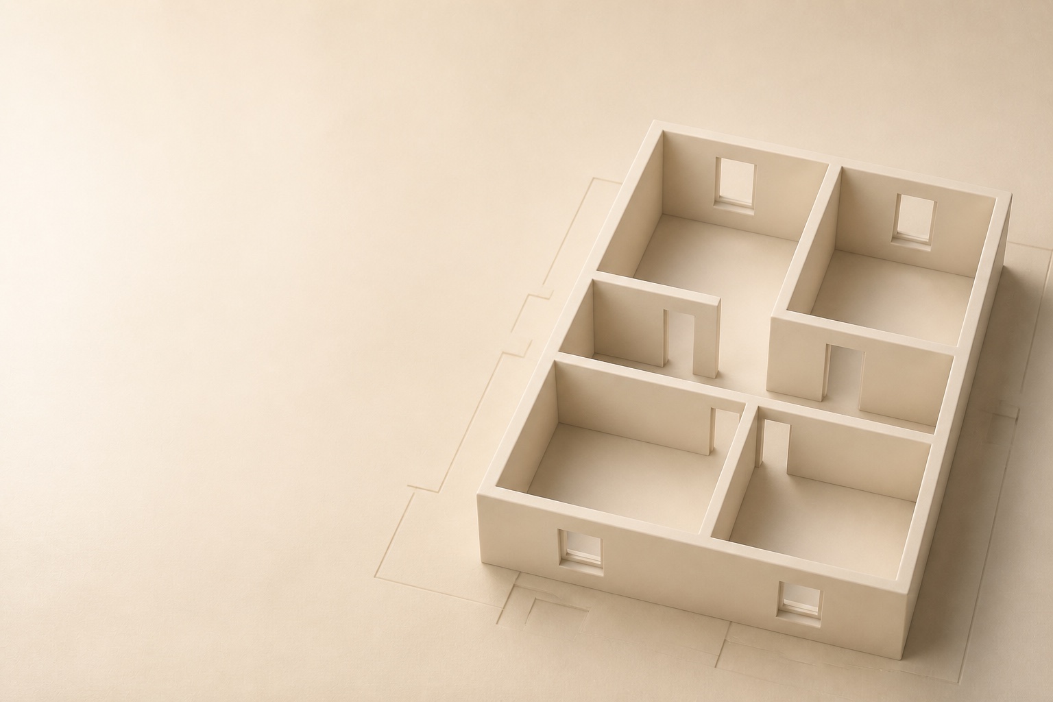
A warm cream architectural floor plan rendered in three dimensions
Keep the architecture. Lose the visual noise.

Room scanning is usually shown as technology: dots, meshes, confidence colours and a great many controls. Overplan began with the opposite question. What if the scan disappeared and left only the useful part behind?

Apple’s RoomPlan framework gives an iPhone with LiDAR a remarkable first understanding of walls, doors and windows. But capture is only the opening act. Real rooms contain awkward corners, missed openings and walls that need a human correction. So the model had to remain touchable: select a wall, move it, resize a window, add the doorway the scan did not quite see.

The visual target was a furniture-free clay model with soft global illumination: warm, legible and almost physical. The difficult part was restraint. Too much ambient occlusion made every corner dirty. Too little made the building float. Camera angle, contact shadow, bevel response and the colour difference between a wall face and its top edge all mattered. The renderer is now close enough to the original picture in our heads that we have formally stopped touching it without a very good reason.

At some point, polish becomes the product rather than preparation for it.

Next comes the quieter challenge: an interface that can orbit, edit, add and measure without resembling CAD. The current answer is contextual editing, plus protected temporary tools only when a tap must mean something different. The model remains the interface.
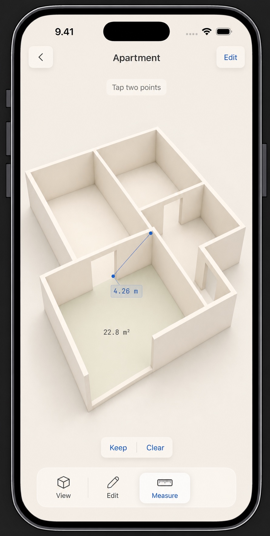
Overplan measurement interface over a cream clay room model
Measurements snap to architectural elements and can travel into the PDF.
RoomPlanLiDARMetalPDF

05 / Overbaro

A weather instrument
with a pulse.

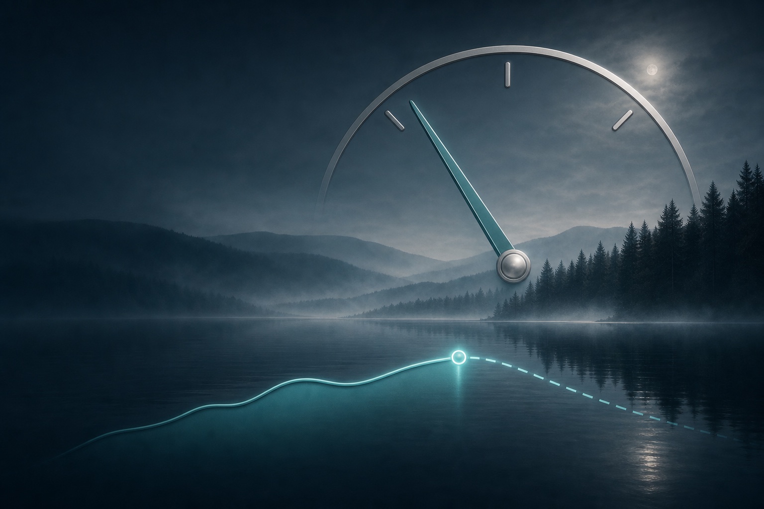
The barometer was already in the phone. The character was not.

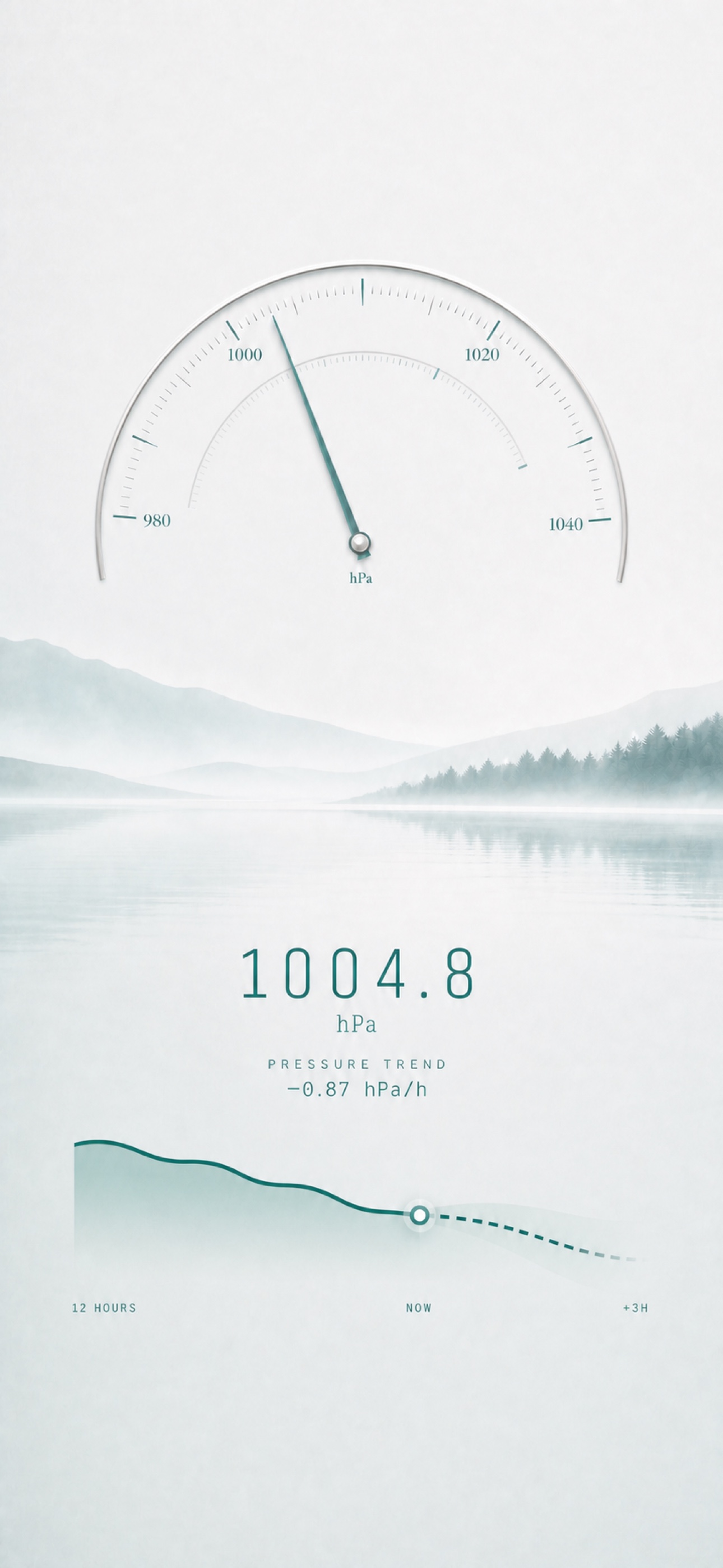
Overbaro light interface with an atmospheric pressure dial
Daylight: information without glare.
Overbaro dark atmospheric interface
Night: the same instrument, a different sky.

An iPhone can sense atmospheric pressure directly. Overbaro turns that small hardware fact into a local weather instrument: not another remote forecast, but a view of what the air around you has actually been doing.

The broad work was straightforward to describe—store readings, classify the pressure tendency, draw a history and make a widget. The memorable work happened in the margins. A chart that was technically readable but not quite calm enough. A light theme whose cloud layer needed less contrast. A needle that indicated pressure correctly but did not yet feel attached to anything.

That needle became hand-movable. Pull it away from the reading and it resists; let go and it returns with a damped spring. The animation is deliberately small, because it should feel like an instrument response rather than a toy. Its haptic arrival must coincide with the visual settle—not one frame before, not one after.

There were five atmospheric themes, each needing its own balance in light and dark mode. A colour swap was never going to be enough. Fog, typography, chart contrast and instrument glow all had to belong to the same weather.

Core MotionBarometerWidgetKitHaptics

04 / Overtiles

Seven materials.
Seven behaviours.

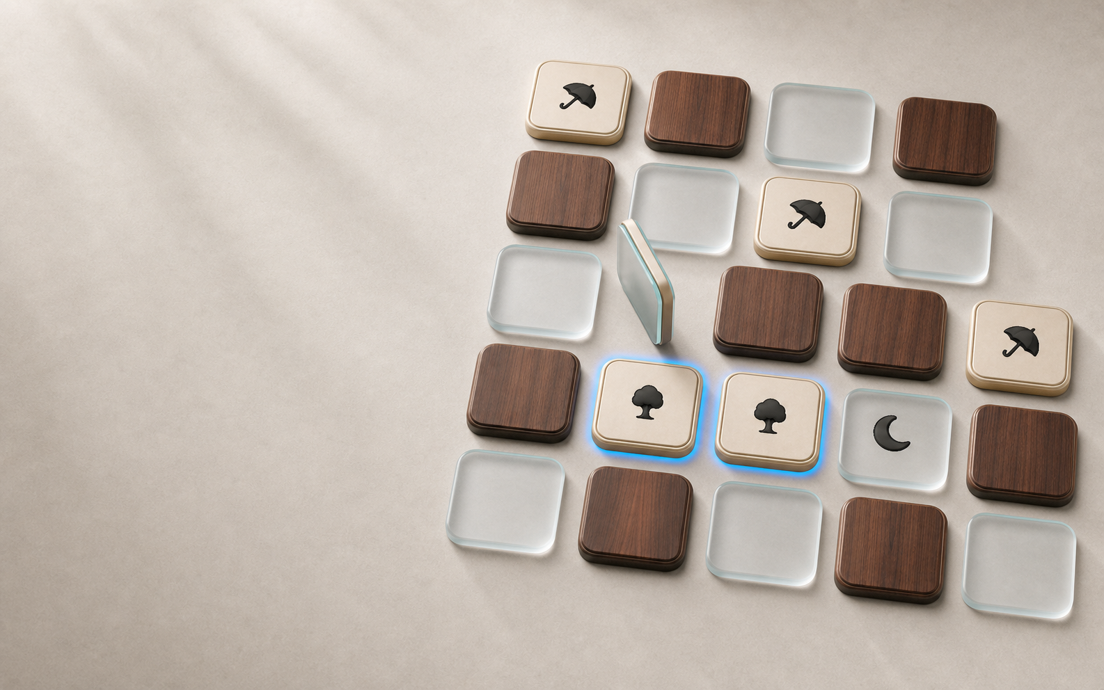
A memory game became an experiment in making glass, walnut and metal feel different through a piece of glass.

Overtiles material tiles arranged as a tactile atelier
The material is not a skin. It determines the response.

The rules of a matching game fit in a sentence. That left room to obsess over everything that happens between touching a tile and seeing what is underneath.

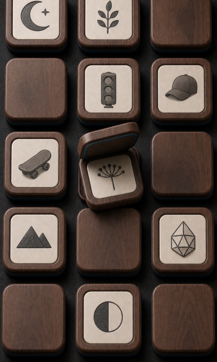
Walnut should lift with weight and return with a soft knock. Glass should answer quickly and sharply. Aluminium should feel precise; leather should absorb more of the impact; piano lacquer should carry a little theatrical confidence. Each material received its own movement curve, sound body, typography and Core Haptics pattern.

The key was synchronization. If the sound announces contact before the tile appears to land, the illusion breaks. If the haptic arrives after the bounce, it feels like a notification rather than material. Motion, sound and touch were therefore designed on one shared timeline, then replayed far more often than any reasonable person would admit.

Natural materials were especially unforgiving. A perfectly repeated wood grain instantly looked synthetic, so the tile set needed variation. Shadows that made a small board feel dimensional became expensive or visually unstable on larger, older iPads. The final answer was not one universal rendering trick, but a controlled set of material-specific compromises.

Close view of a warm walnut Overtiles material
Walnut demanded variation, weight and a quieter return.
Core HapticsAVAudioEngineCore AnimationiPadOS

03 / Overbark

Your dog,
subtitled.

An on-device experiment in bark, posture, scene and the comic timing of a speech bubble.

Two terriers in a warm editorial Overbark scene
Two dogs create a surprisingly complicated conversation.
Overbark interface reacting to a dog watching a bird
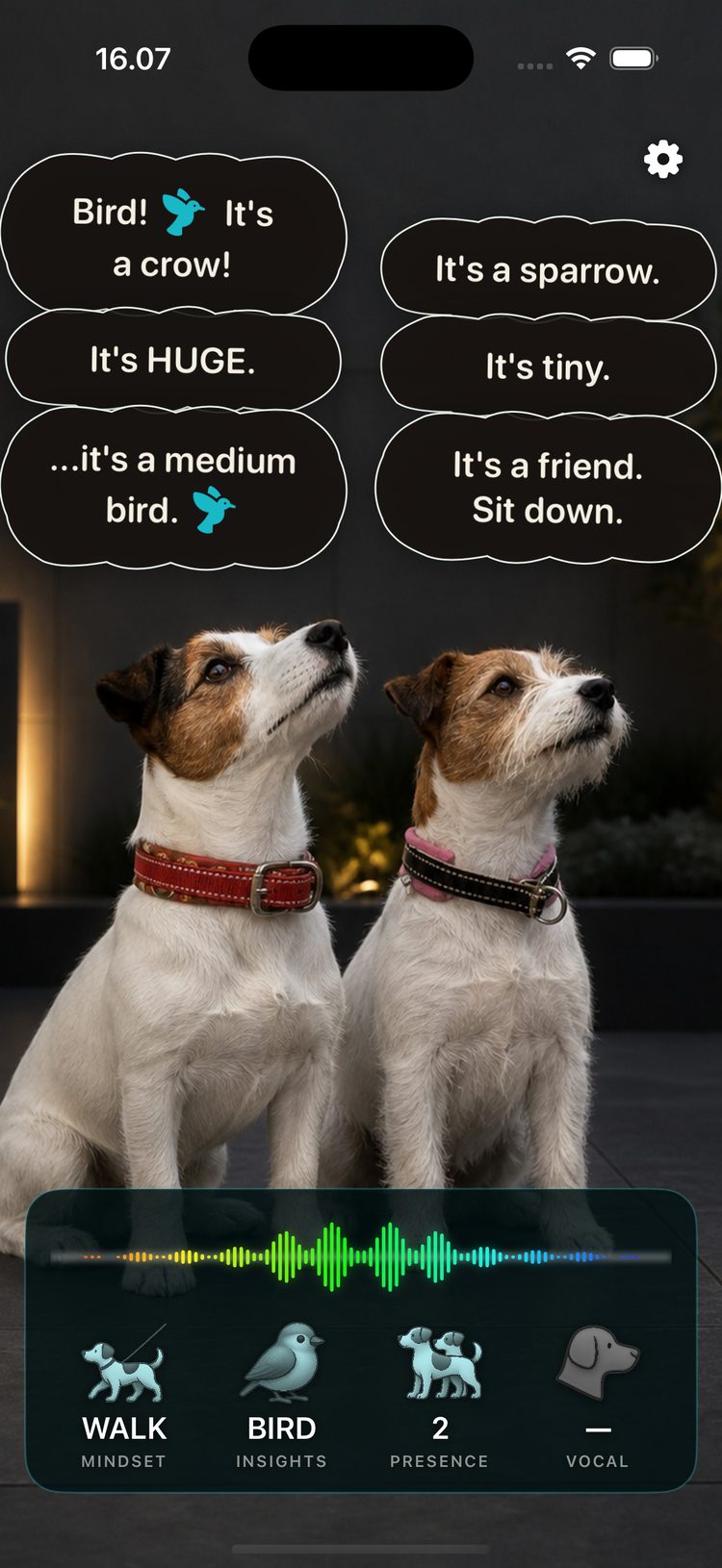
Context changes the joke—and the reading.

A bark alone says less than people imagine. A bark plus body posture, repetition, another dog, a doorbell and one extremely visible squirrel says rather more.

Overbark combines live acoustics with Apple’s on-device Vision capabilities and scene context, then turns the result into playful speech bubbles. It is intentionally an interpretation, not a claim of canine fluency. The fun comes from confident specificity while the product remains honest about the guess.

Keeping the experience local mattered. Camera frames, sound and the evolving little history belong on the device. It also made latency part of the design problem: detection, visual lock and bubble arrival had to feel like one response rather than a queue of technologies taking turns.

Then came the less glamorous work: permissions that explain themselves, App Store screenshots that show genuine captures clearly, privacy answers, age ratings, metadata, build uploads and a review path with no mysterious surprises. Making an app is one discipline. Making it understandable to a store page is another.

VisionOn-device audioCameraPrivacy

02 / Drivescape

What if the road
played back?

A generative score shaped by acceleration, braking and the arc of a corner.

Electric blue Drivescape driving visual
A drive has rhythm before it has music.

Drivescape started with a mischievously simple idea: the car is already moving through a composition. Could the phone hear that movement and score it live?

Motion sensors can reveal acceleration, braking and cornering, but raw signals are not musical. Roads vibrate. Phones shift in their mounts. A gentle bend and an aggressive lane change may briefly resemble one another. The development challenge became one of extracting intention without making the score feel delayed or nervous.

The sound cannot merely react; it has to anticipate enough to feel attached to the vehicle. Too literal, and every bump becomes percussion. Too smooth, and the road disappears. Themes evolved into distinct sonic worlds, with visual surfaces that suggest their energy without asking the driver to study a dashboard.

It also established an early mcfinapps habit: build the difficult sensory loop first. Marketing pages, icons and launch plans matter, but they cannot rescue an interaction that does not feel inevitable in the hand—or, in this case, through the seat.

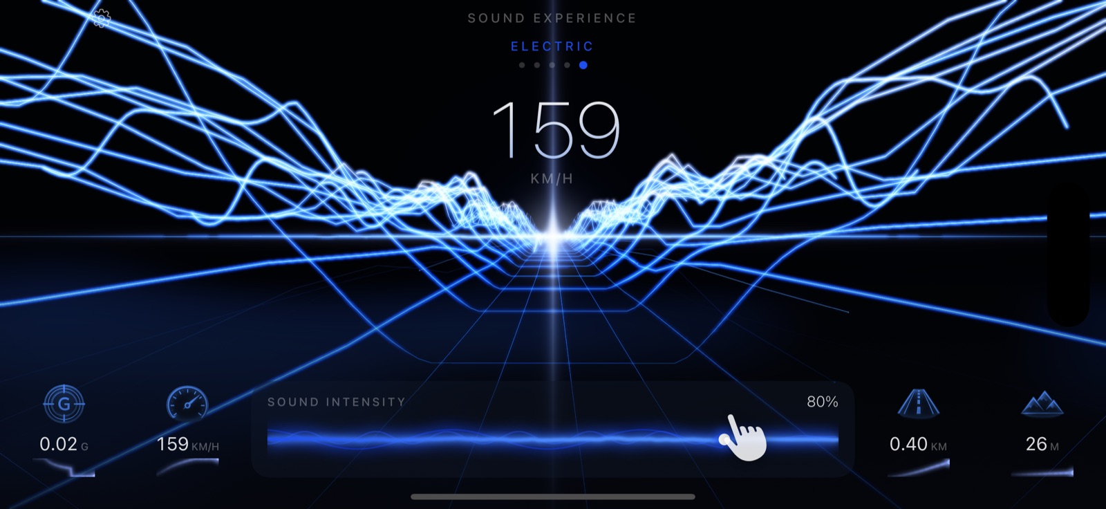
Drivescape running in landscape on iPhone
Landscape, glanceable and deliberately low on controls.
Core MotionGenerative audioRealtimeCarPlay thinking

01 / mcfinapps

Small apps.
Deeply made.

Beginning an independent Finnish app studio with a deliberately disproportionate standard of care.

mcfinapps orbital studio mark

Focused software.
No subscriptions.
No advertising machinery.

mcfinapps began with a preference: small software should be allowed to feel complete.

Not every useful idea needs an account system, a social layer, a growth funnel and a recurring payment. Some ideas deserve one excellent screen, a clear price and the confidence to leave the user alone. Pay once. Keep the app. No ads. No behavioural profile quietly becoming the real product.

The studio’s working method is equally straightforward: choose a focused idea, prove the difficult interaction early, then polish the whole experience as one object. Interface, motion, sound, haptics, icon, website, screenshots, privacy language and App Store presentation all belong to the product.

Version control arrived as the collection became real enough to deserve better discipline. So did release checklists, device testing, visual baselines and the humbling knowledge that a successful build upload can still be followed by several pages of questions about encryption, privacy and regional availability.

“Fine already” is a milestone, not a shipping philosophy.

This journal records the useful parts of that process: what the devices can do, where the illusion breaks and why a tiny spring animation may occupy an unreasonable afternoon. There will be no secret machinery here. Just the craft, the decisions and the occasional scar tissue.

FinlandIndependentPrivacy firstOver-engineered

More from the workbench

The next detail is
already bothering us.

Explore the apps